Empire Apartment
Empire Apartment
CHUNG SHAN HOUSE
Causeway Bay, Hong Kong
1.5 Bedroom Apartment; Full-Scope Design
Causeway Bay, Hong Kong
1.5 Bedroom Apartment; Full-Scope Design
Zhong Shan, China
3 Bedroom House; General Design
A modern and chic designer apartment in an old Hong Kong block. While it was a completely new renovation, we kept the original floor and windows to retain some of the memory.
High contrast black, white and bronze colours were bold design statements chosen to complement the vintage theme.
A modern and chic designer apartment in an old Hong Kong block. While it was a completely new renovation, we kept the original floor and windows to retain some of the memory.
High contrast black, white and bronze colours were bold design statements chosen to complement the vintage theme.
A 3-storey holiday house located on a prestigious golf course in Mainland China.
Whilst elegant and chic, the design featured low maintenance finishes and flexible spaces for various guest arrangements.


Alchemy Origin
Project Type: Cafe
Location: Two Taikoo Place, Quarry Bay, GF Lobby
Design Team: John Chow, Renee Chow
Lighting Designer: Light Origin Studio
Accolades:
A&D Awards 2023 - Best Restaurant and Bar - Bronze Winner
Muse 2023 Season 2 - Gold Award
IDA Design Awards 2023 - Silver Award
LIV Hospitality Design Award 2023 Winner
Project Brief
Metagram has designed Alchemy Origin, the newest cafe addition to the Alchemy Coffee group, in the premier business district of Tai Koo Place in Hong Kong’s east.
Nestled into the chic, newly completed lobby of Two Tai Koo Place, the cafe is located in a narrow and winding space which sits between a curved courtyard-facing facade and an S-shaped wall bordering the building’s commercial lift lobby.
Aside from the extremely challenging shape, the elongated site had multiple entries and easements, including five fire exits distributed along its perimeter and a large window, created to provide daylight access into the building’s inner corridors.
Alchemy’s first cafe was opened nearby in 2012 and departed several years later. In the years that followed Alchemy had grown into one of the largest green-bean coffee importers and roasters in Hong Kong. Thus the new design was to have an atmosphere of “homecoming” to tell the story of the brand as it was 11 years later in 2023, and have symbolic design elements of the far less visible story of coffee production from farm to table.
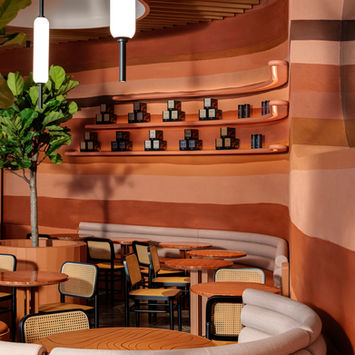
Metagram designed a scheme whose colours and form were inspired by ‘topography’ and ‘coffee origins’. Coffee is sourced from across the globe and is grown in vastly different topographic and environmental conditions. Metagram carefully sculpted the layout and key architectural features as dramatic curved objects synchronised with the challenging shape of the site. The outcome was a rich and dynamic cafe environment, perfectly tied in to its curved context and distinct enough to highlight the Alchemy brand. The design successfully navigated extremely complicated geometry and external input, whilst complementing context and creating a successful brand and dining experience.
Metagram’s approach to the design was contextual and sculptural. As a highly visible site with a large glass frontage and an open entry from the commercial building’s main lobby, the best approach was to create a design that would visually blend with its context, whilst also telling the story of the brand.
Metagram retained the greater lobby’s stone floor finish and ceiling baffle system. These finishes surrounded the very transparent site and so their retention would visbly tie the cafe interior into the context. The baffles undulated, creating a landscape of its own, and complemented the concept.
A large stone cladded wall, curving through the original space was furred out and refinished in textured plaster and warm red tone pigments to mimic rammed-earth construction, a method of building that is essential to rural Ethiopian architecture and a common sight on the African coffee plantations.
Custom banquettes and loose furniture were designed to represent materials and colours of the rural plantations. Terracotta rough surfaced tiles, like brickwork, wrapped the fixed benches and planters, which curved through the space forming a built-organic topography of its own. Tables of red travertine with its many horizontal layers visually tied into the rammed-earth wall, while chairs with rattan finish would provide a link to the traditional woven coffee baskets commonly seen in the Indonesian farms.
Distributed through the cafe were tables with lazer cut topography, and in the centre of the dining space, Metagram incorporated an architectural topographic model of a typical coffee farm in the mountainous regions of Colombia into a communal table.
Cladding a three metre diameter column, Metagram designed a coffee pod inspired feature shelf. Concave channels ran from floor to ceiling around the column creating nooks which would hold display pods, some containing retail items, and others would showcase symbolic and sentimental paraphernalia the Client had collected from the coffee farms around the world.
The espresso bar was the one element within the the design that intentionally departed from the curved design aesthetic. Masterfully constructed according to the dimensions of a specific ceramic tile, the distinctly geometric form would symbolise the precision of artisan coffee making. The simple geometric form would contrast with the rest of the store without being too visually busy.
In the ceiling of the space, five cylindrically shaped skylight-like features penetrate the baffle ceiling. The varying mass and heights of the elements emphasising the topography of the ceiling whilst creating evocative spaces with the furniture elements below. Winding through the centre of these ceiling features and playfully terminating around the smallest was the crowning element of the design. This beautiful and painstakingly sculpted fin, would appear like an illuminated river or a ridge; its composition and design intentionally developed to organically tie each individual element and the context together.
Within this design, the retention of the ceiling and floor helped to minimize unnecessary waste, whilst not compromising on the design concept, in addition all lighting was intentionally selected as LED and dimmed to minimize energy consumption.


